
OfferUp
UX/UI Design Case Study - Redesign the seller’s experience
In 2018, the event industry was valued at over 1,100 billion USD. As interesting as this market may seem, most events have non-returning customers and unsatisfied clients. Some potential targets do not even assist due to the annoying webpages that promote such events As a UX/UI Designer, I was recently tasked with a hypothetical challenge that consisted of designing a mobile version of a micro-site for an event under four (4) days. In this article, I will take you through m design thinking process.
Discovery
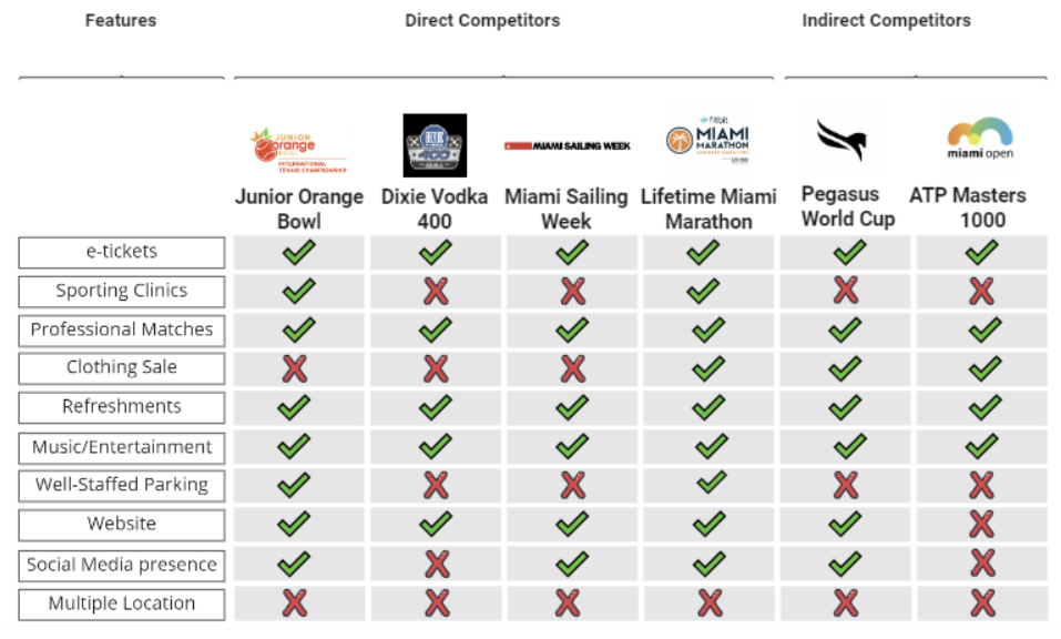
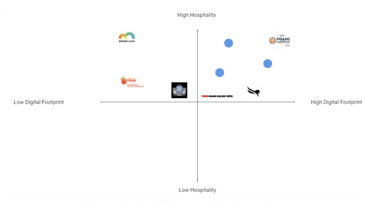
To begin I started doing some secondary research on events and direct and Indirect competitors to get to know what is out there. After gathering this information, I built a feature comparison matrix, a tool used to analyze what the competition offers. Afterward fashioned a market positioning chart to identify what areas do my competitors cover and which ones are still uncovered. Here are the pictures of the result.
This gave me a clear vision of what I was getting into, but there is no value in innovation without human-centered research. To complement my discoveries y designed a survey to find some quantitative data and Interviewed five of my respondents to figure out the qualitative details. My surveys were helpful to realize the pain points and negative aspects of current events and websites. I also what people most found essential in sporting events. Surprisingly it was not exhibition matches or tasty drinks, but staffed parking, online tickets, and open spaces.
““Most of the time, event websites look like government sites…They are filled with bottled up information and browsing the site becomes a headache”. -Intervewee”
Define
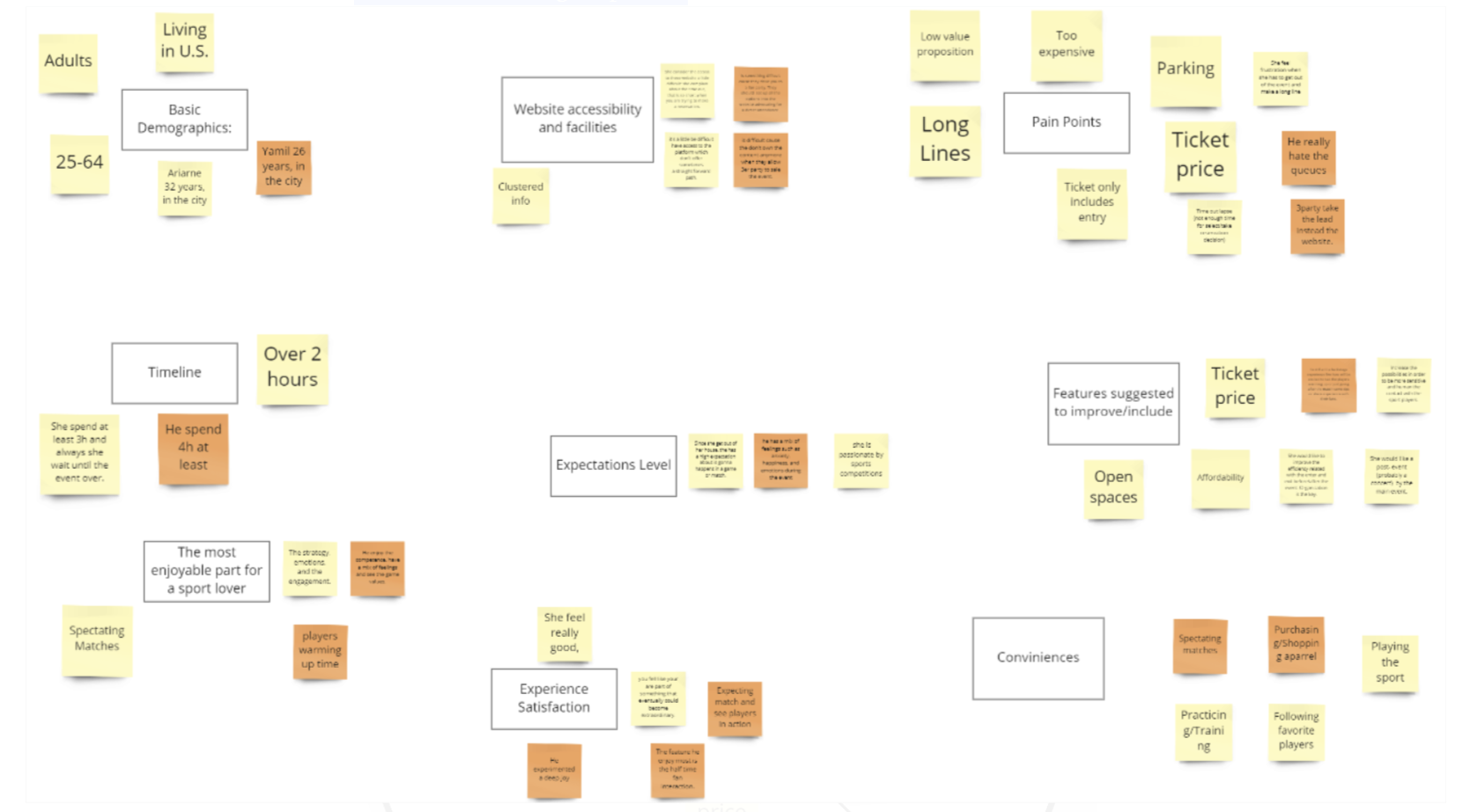
Having a clear vision and data to work with it was time to start putting the pieces of this puzzle together. The best way to begin is by organizing our insights in an Affinity Map. This tool is used to sort and label data, making it easier to access during the process.
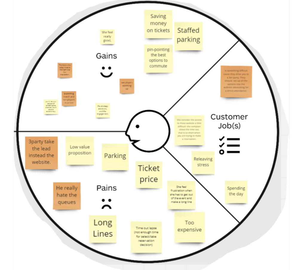
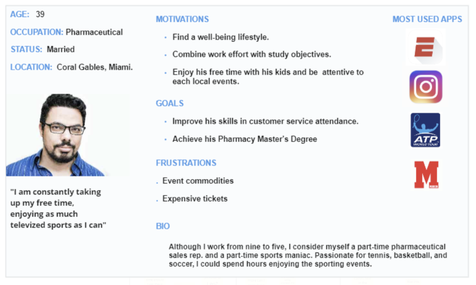
Afterward, we took this data and built a customer profile map to determine who we are designing for. This was imperative to create a user persona. A user persona is a fictional character built out of the data collected to help designers focus their target audience through a person. Take a look.
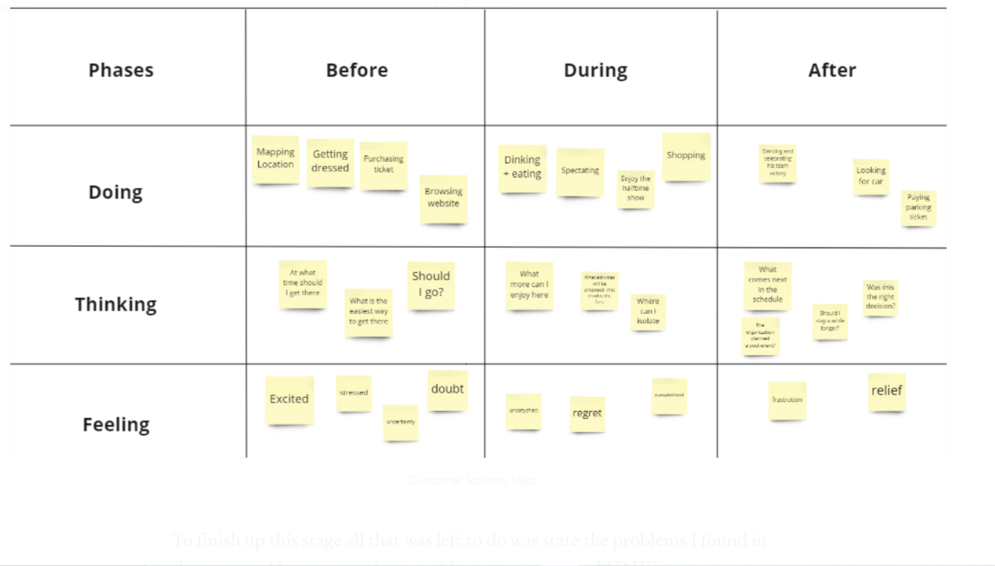
Having a user persona at hand I was able to illustrate what the current process of going to an event is like using an As-Is Scenario. Later I created a customer journey map to figure out the opportunities to enhance micro-interactions in the flawed service.
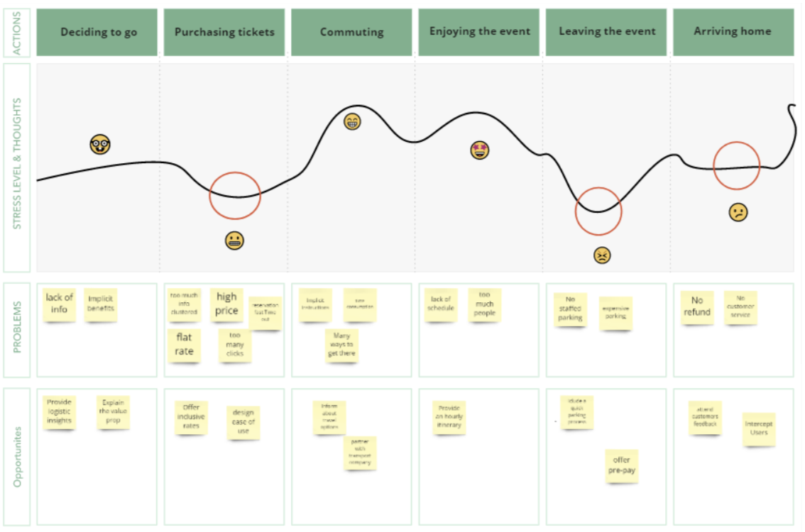
To finish up this stage all that was left to do was state the problems I found in the process. Here are my three problem statements and HMWs.
1- Users need a more efficient way to collect information on event details and offerings.
How might we help inform users about the whole spectrum of event details and offerings?
2- Users need a way to get emotionally engage at the event because it will complement and add value to their experience.
How might we add emotional value to the user's experience through this sport event?
3- Users need a way to not feel frustrated or crowded when attending events.
How might we ensure users will not feel frustrate or crowded when attending the event and they have high expectations?
Ideate
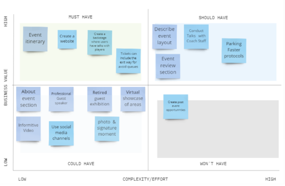
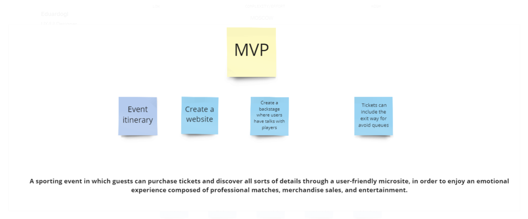
To begin Ideating I took 5 minutes of alone time with each how might we statement and wrote down potential solutions that came to mind. After coming up with 25 unique ideas I had to sort them out. In order to do so I used the MOSCOW method, a tool designed to separate and prioritize ideas into those that the product Must-haves, should-haves could haves, and won't have. To add more value I combined my MOSCOW chart with a complexity/Impact chart.
After this, I just had the pieces to define my minimum viable product.
Develop
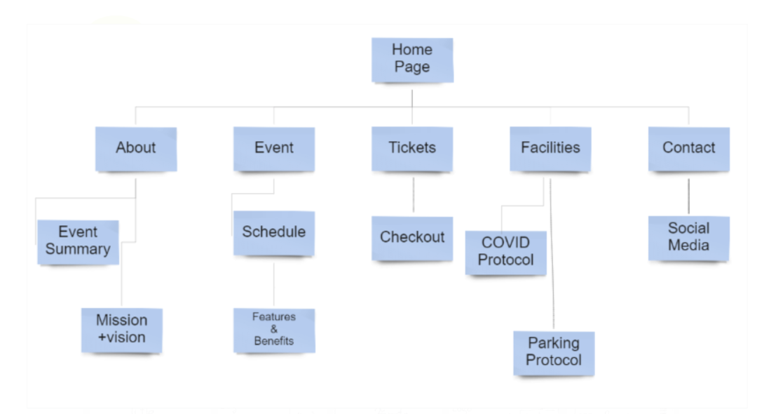
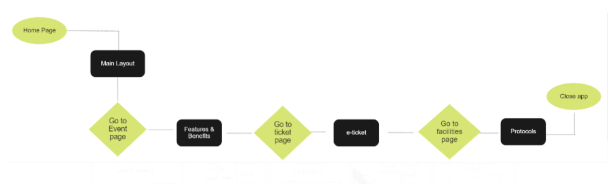
The first step to this stage was to sketch out a sitemap. This is an overlay of what the website will include. After having this at hand, I went on to design a flow chart of tasks to be achieved on the website. This was the rock through which I based my designs.
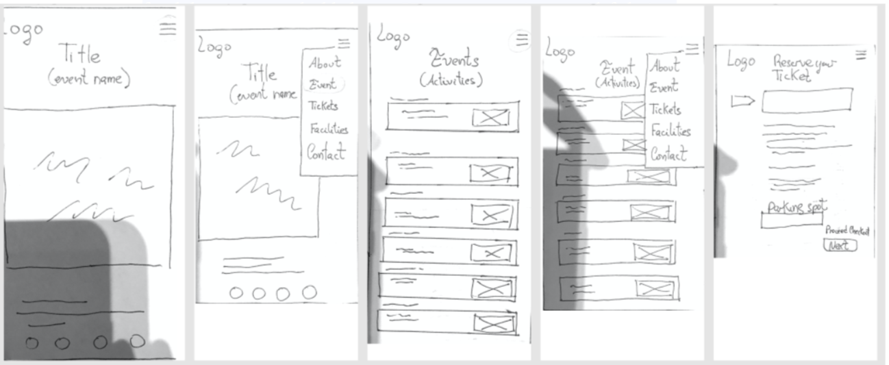
Finally it was time to get my hands dirty and design some low fidelity and mid fidelity designs. I started with some low-fifedlity sketches just to figure out where my components would be and iterate if I found any errors. Then, I fixed these errors and added some UI components in my mid-fi design.
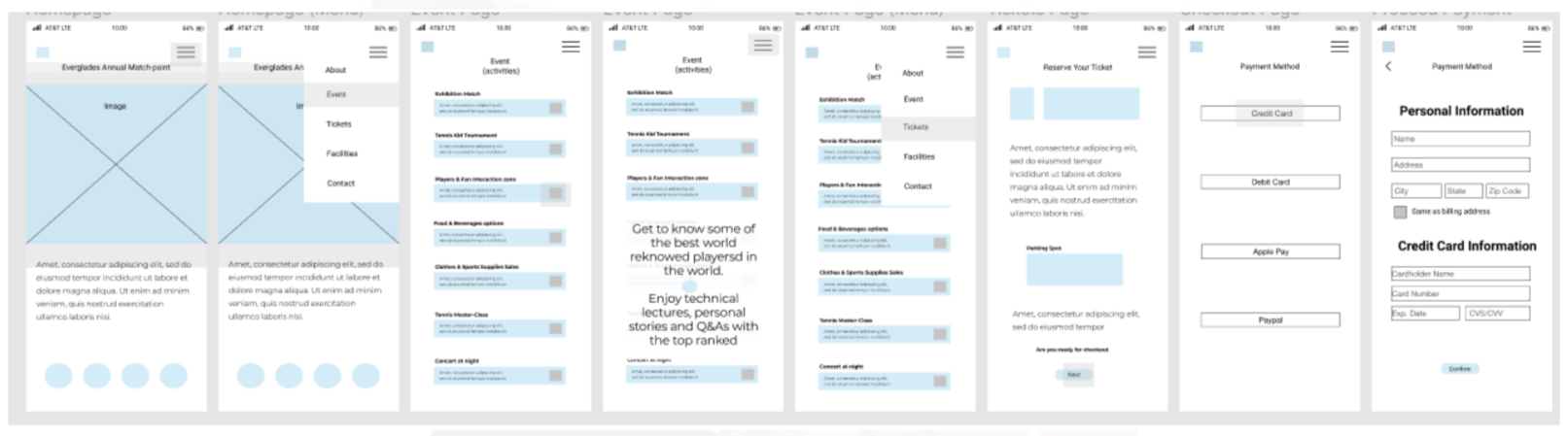
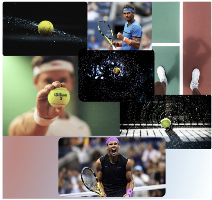
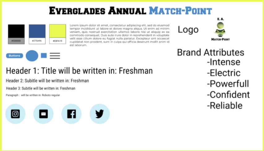
After I tested my designs, I went on to create my high-fidelity. Nevertheless, before jumping in to the next design, it was imperative to sit down and figure out my styles. In order to do so, I started playing around till I had a mood board and then created a style tile.
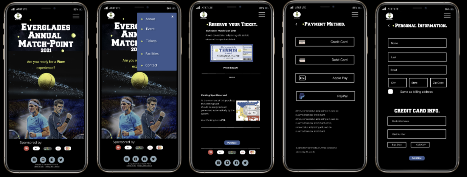
Then, I designed my High-Fidelity design and prototyped it as well, getting the final result.
As any other project, this one was challenging, exciting and with out a boubt entertaining. As a Tennis player and UX/UI Designer,combining to passions is a true privilege.