OfferUp
UX/UI Design Case Study - Redesign the seller’s experience
Boosting Sales is one of the most important aspects of any thriving company. In this particular case, I am referring to the sales of the users. For my final project as a student at Ironhack, I have collaborated with OfferUp in order to boost sales through social media. In this case study, I will describe my complete UX/UI Design process from the discovery to the delivery phase. Let the record show that this was an academic project and some of the steps in my process will not be disclosed for legal reasons after signing an NDA.
Discover
As usual, I started my project by doing secondary research on the company and the app. This was crucial due to the fact that I had not to heard of them before. After downloading the application and researching the business I was able to get a good grasp of what I was going to be working with. For those of you that do not know, OfferUp is an amazing mobile application that empowers users to buy and sell items in an easy manner. I was really impressed with the simplicity and aesthetics of the app, but of course, there are many ways to buy and sell, so I dove in to do some market research.
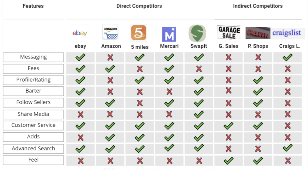
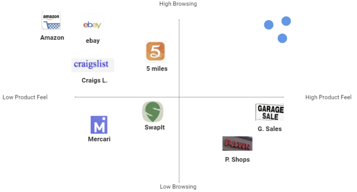
Using a Feature Comparison Chart, I analyzed what is currently out there in the market and what is missing. This is a great tool to figure out the value that direct and indirect competitors offer and get to know what users expect in a new product. Below you can see a picture of my process.
Upon completion, I realized that most of the current options are neither social media-friendly, nor allow customers a good product feel. This took me to grab these features and analyze them with a Market Positioning Chart, to visualize unattended gaps in the market.
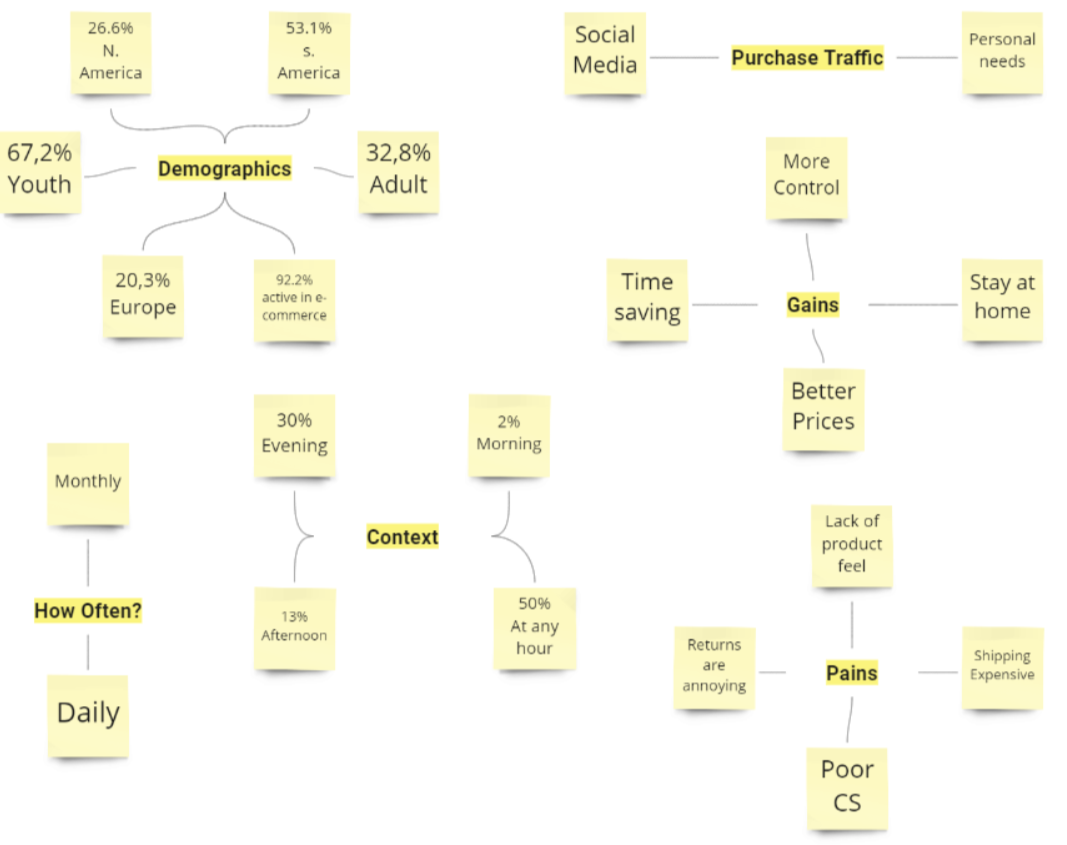
As enlightening and helpful as market research may be, it is imperative to perform User-Centered Research (UCR) to study the client's experience. In order to do so, I began by doing quantitative research through surveys. For this project I translated every question on my survey, having them appear in English and Spanish to make them more inclusive and achieve more responses. After publishing, I reached ninety-six (96) responses, filled with demographic emotional, and contextual data.
Further on, I decided to bring some qualitative data to my table as well. I began by researching online reviews on the app and its flow. Later on, I continued my discovery by performing five (5) interviews.
“I think there is a growing demand to steer away from market giants such as Amazon and find ways of making online commerce responsible and sustainable.” - Interviewee
“The problem I have with OfferUp is the sellers. I never have enough information about the product.”- Interviewee
Define
Having so much information to work with, it was time to start making sense of my data. I started my organizing my findings in an Affinity Map. This is a great tool to sort and label ideas for easy access along the way. Based on all my data, I decided that the person I would be designing for was a power seller. Someone who uses the app as often as possible to find new sources of income. After all, I was inclined by my brief to focus on the seller. I analyzed a user persona provided by the OfferUp team to guide my process.
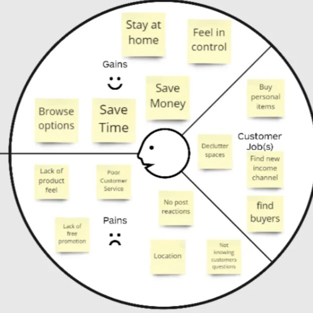
In order to identify my user personas' emotional frustrations, motivations and jobs to be done, I built a Value Proposition Canvas. For this moment I only wanted to fill in the Customer Profile Side.
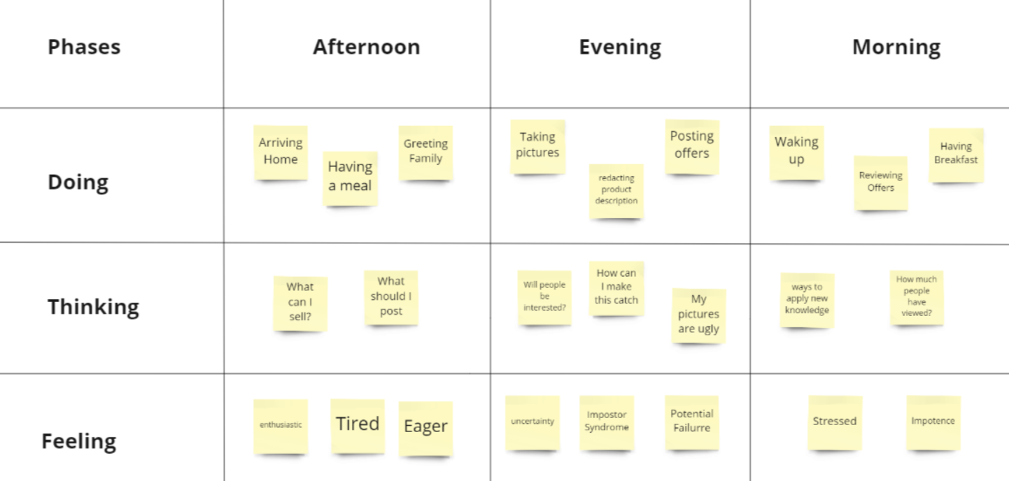
Having my target well defined, I moved on by using my contextual data and in-depth insights to build out an AS-IS scenario. This is a visualization of what the current process is looking like. The tool helped me identify how the seller is feeling in the different stages of his experience.
Develop
To go even further it is always opportune to have a customer journey map at hand. In this particular project, I used and analyzed one provided by the OfferUp team which for legal reasons I cannot disclose. Nevertheless, I was able to pinpoint 4 opportunities that led me to define my problem statements.
-Sellers need a way to publish and share their offers through social media in order to gain buyer traffic.
-Sellers need a way to post neet pictures in order to attract buyers.
-Sellers need a way to identify the level of interest in an offer in order to filter offers from inquiries.
Now that I had a clear vision of the main problems I could solve, it was time to ideate potential solutions. I converted every problem statement into How Might We statements. How might we solve…?
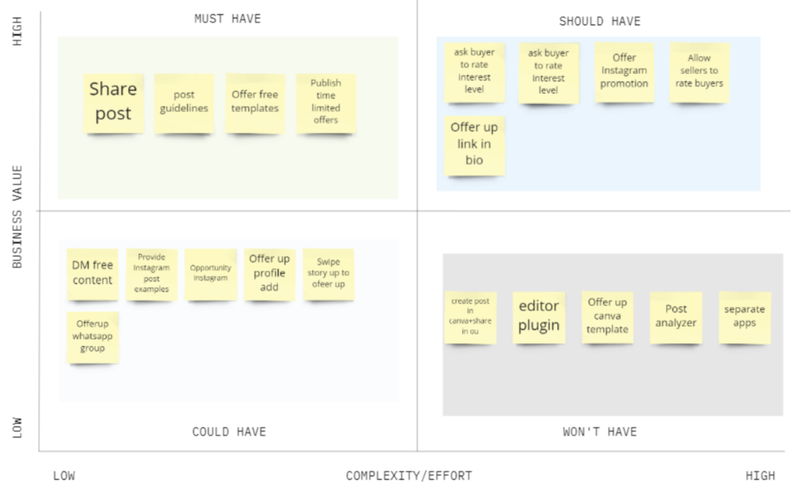
I took five (5) minutes with each HMW and came up with nineteen unique ideas. Of course, not all of my ideas were viable or feasible so I sorted them out using the MOSCOW method. This is a great tool to see what ideas my final product must have. I also combined my MOSCOW with a complexity-impact graphic to ease my decisions.
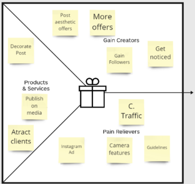
After visualizing the four (4) ideas I would implement, I wanted to make sure that all of them were aligned with my user's pains and gains. In order to figure this out, I completed the business side of my Value Proposition Canvas.
To conclude my Develop Stage, I sat down to state my minimum viable product or MVP.
An app redesign in which two added features allow sellers to use templates and publish posts on networks to increase sales
Deliver
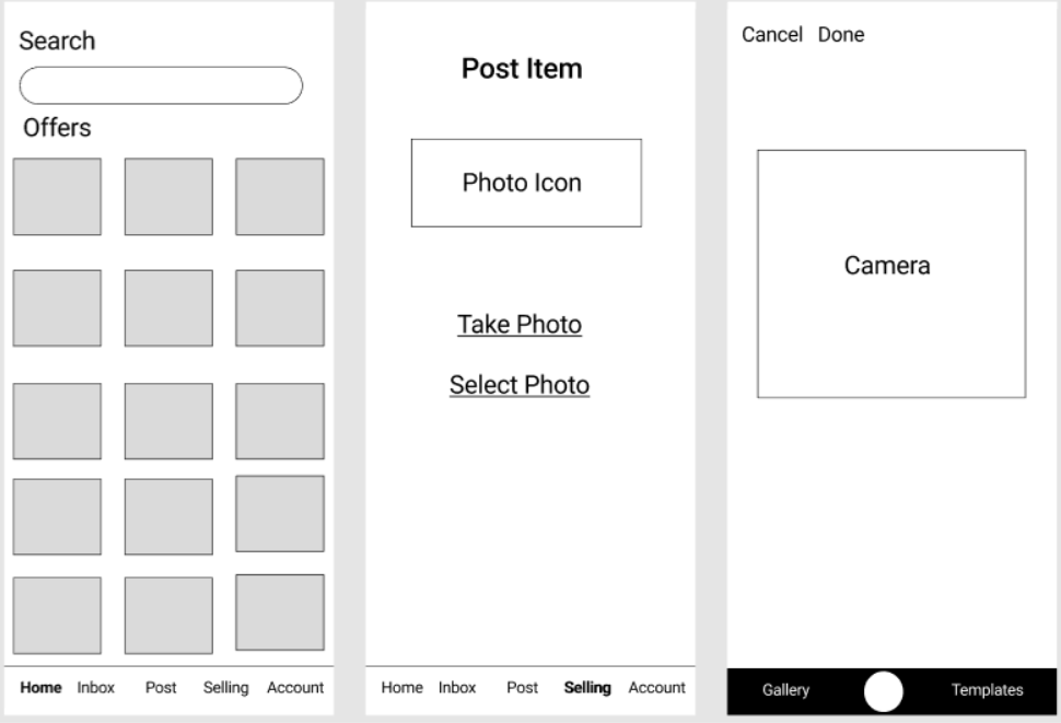
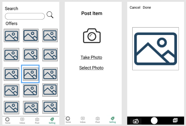
It was finally time to hit the ground running and start designing my version of the OfferUp app. I began my doing some low-fi prototypes using Figma and testing my prototype using Maze. After finding hiccups and iterating on my designs I finally got to my Mid-Fidelity designs where the same process was completed.