OKY
UX/UI Design Case Study - A summary of my 1st month at OKY
Initial Analysis
The OKY Design team is composed of a Project Manager, one designer who works on the current version of the app, and one who works on the upcoming iteration, which is me. On my first day, I started doing an initial audit of the current prototype to find some visual pain points. Many of my observations relied on UX practices on the homepage. For example:
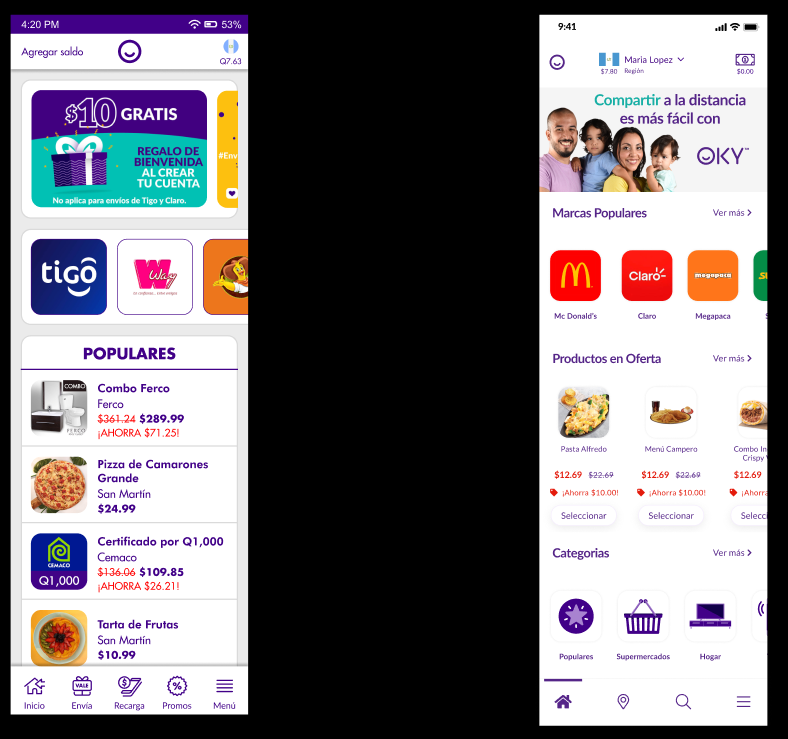
Although they are labeled, the icons in the footer menu do not present any micro-interaction or feedback when clicked. It is ideal for the icon to have some sort of clicked state to indicate to the user where he is in the app.
Footer Menu
On the other hand, the onboarding process for first-time users comprised 15 clicks necessary to arrive at the landing page. Many users were neither getting through the process nor granting the app permission to access contacts and location, which are imperative to its main features. After presenting my initial analysis and being adequately briefed on the company's user data, I began with my first assignment. Wireframing a new version of the homepage.
Wireframing
Since many changes and added features were to come in this iteration, I began by doing some simple black-and-white designs, using a Figma community wireframing kit. To start off, I worked on the onboarding process flow and moved on to the landing page for first-time users. My design was to have a screen for all three permission requests (contacts, notification, and location) composed of an illustration, an upper text indicating the permission, and a lower text stating the reason behind the request. All of these would follow up with the OS modal. After testing, I realized that most of the users would not read the amount of text on each screen. For this reason, I called in the other designer on the team to help me out and we came up with a solution for this problem.
Delivery
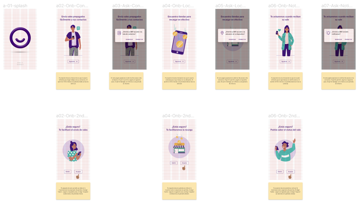
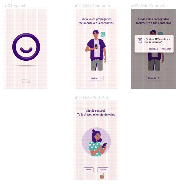
We designed a pattern in which every onboarding screen would have a short text indicating the permission that would be asked and an illustration. After clicking “continue” a permission modal designed by us would pop up. If the user selected selected “yes” the OS permission slip would show up for them to confirm, but if the user selected “no”, they would go back to a screen asking them a second time and stating the importance.
After its approval, I was able to successfully design the new onboarding process and hand it off to the development team. As usual, I added notes below every screen to state the importance and reason behind every interaction.
Homepage
After completing this 5-day design sprint, I went back to step one and began working on the homepage. As before, I worked with wireframes to figure out the content layout which was my main focus. The key challenges were that the footer menu was going to be left out, transitioning the app to header navigation, and adding two new features to it.
The idea behind the design was to have a shopping cart and categorized carousels, for users to add several products and make a checkout. In addition to this, we added promo strips to show special offers and important information. Although this layout was proving to be on point, we came to realize a bigger problem. Since the app is a marketplace for central American brands, the homepage had to be tailored to the country and region of the users' preferences. The two options I proposed were to either integrate that ask in the onboarding process or in the homepage itself.
After I designed a high-fidelity prototype of the homepage, I adapted the flow with the two options proposed and did some A-B testing. In order to do so, I added an additional screen in which interviewees could select between scenarios A or B. The idea was for Scenario A to have the country and region selection in the onboarding flow and for Scenario B to have it built into the homepage of the first-time user experience.
After testing, we decided to move on with scenario A, having the user select a country and region in the onboarding process. This file was passed on to development, but regardless, some changes started to become necessary for the already-done homepage. As soon as I started wireframing the next steps of the flow, we realized that a lot of the main features of the app were hidden in the hamburger menu and were not being given the necessary predominance. However, locating them in the header was a problem because it was already clustered with CTA’s and main information. After a long meeting, we decided to bring back the footer menu and I started working on several options for information architecture. After a week of meetings, iteration, and testing. We were able to finish the homepage. This is how it came to be.
After one month at OKY, I was able to finish my design challenges and add value to their product. This was truly a great experience filled with obstacles, persistence, hard work and as always, a little fun along the way. Thank you for reading.


