
Whatsapp’s Missing Feature
UX/UI Design Case Study - Add a feature
Over 2.77 billion mobile phone users access messaging apps to communicate with others. During a UX/UI Design course, I was challenged to add a feature to a world-known messaging app of my preference. This project was strictly academic and had a timeline of four days to be completed. In order to complete my assignment, I used the Design Thinking methodology and began my sprint. In this case study, I will disclose the Discover, Define, Develop and Deliver stage of my project, as well as some key learnings and design tools of my process.
Discover
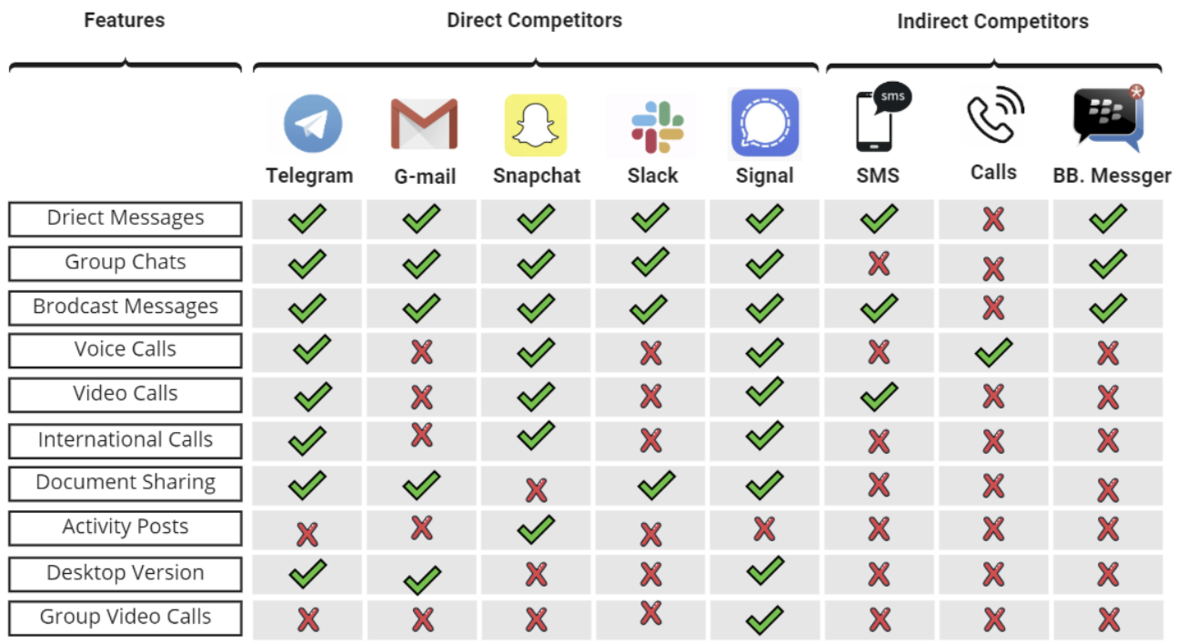
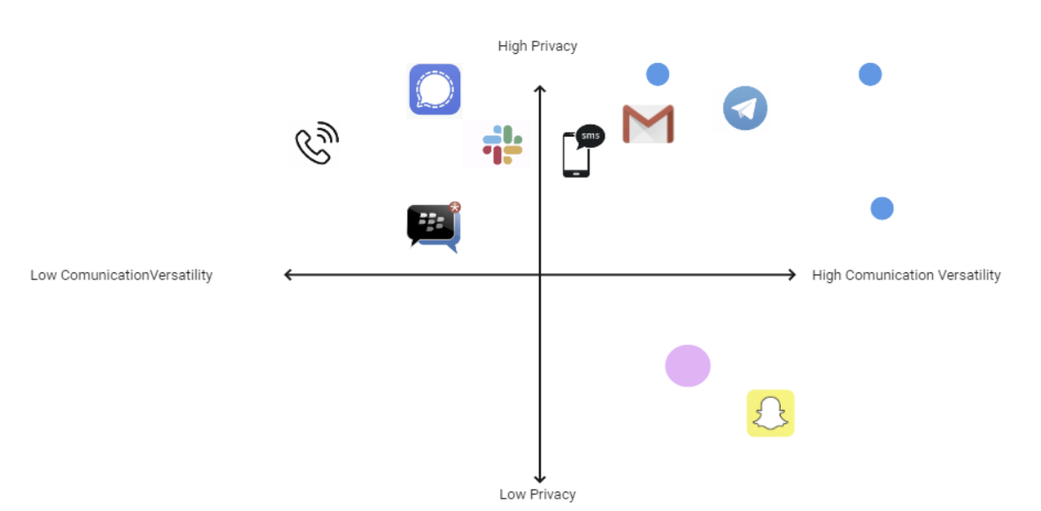
To start my project I began doing some secondary research on the app, the company, and even some demographic insights. But, none of this is enough to get a clear view of the context, so I decided to do a Marketing Positioning Chart and a Feature Comparison Chart. These tools were able to give a clear vision of the market and the differences between the products currently out there.
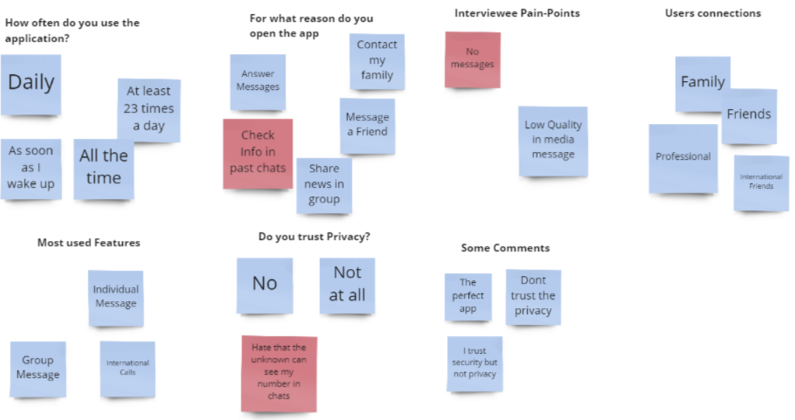
As much insight as these tools can provide and open up my mind, as a UX Designer, it is my responsibility to discover what the users feel when using the product. To do so, I designed a survey using Google Forms which had eighty (80) responses. After finding out that over sixty-five percent (65%) of users use the app for not only social but also professional connections, I wondered if there was ever any problem with that. I also realized that as many features as the app may have, over fifty-eight percent(58%) of my subjects mostly use the app for individual messages. Having this quantitative data, I decided to complement my findings with five (5) interviews with day-to-day users.
“I am tired of sending my coworkers messaes that were meant for my friends” -Interviewee
“Sometimes I need to message someone but it is too late. But the next day I always forget.” -Interviewee
Define
After I concluded my discovery, I started moving into the define stage of my process. To begin, I made an Affinity Map to cluster all of my findings. This brought a lot of value because I was able to organize and label all of the information I had compiled. Although I have started already to define my process, empathy takes place in all steps of a UX project.
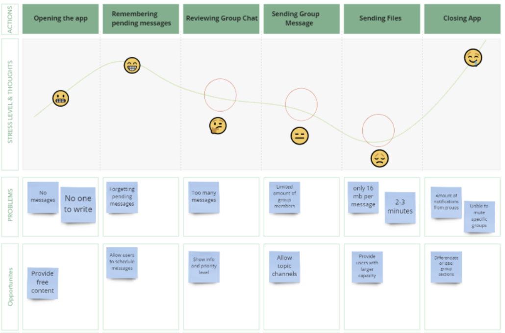
This is why I made an As-Is Scenario, a simple tool to visualize what users are currently going through. Then, I complemented this chart with a Customer Journey Map to pinpoint opportunities in which I could make my clients' lives easier.
With the insight provided by these tools, I concluded my defined stage by distilling three (3) problem statements and How Might We’s to focus on.
Users need a way to schedule messages because it will avoid forgetting pending messages at appropriate hours. // How might we help users remember their messages to be sent and send them at appropriate hours?
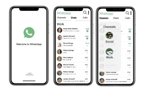
Users need a way to organize their contacts and group chats because professional and social connections get mixed in the same channel. // How might we help users organize their contacts?
Users need a way to restrain people from having their account info and number by being in the same group because personal info is public when the number is given // How might we Help users maintain a sense of privacy when using the app?
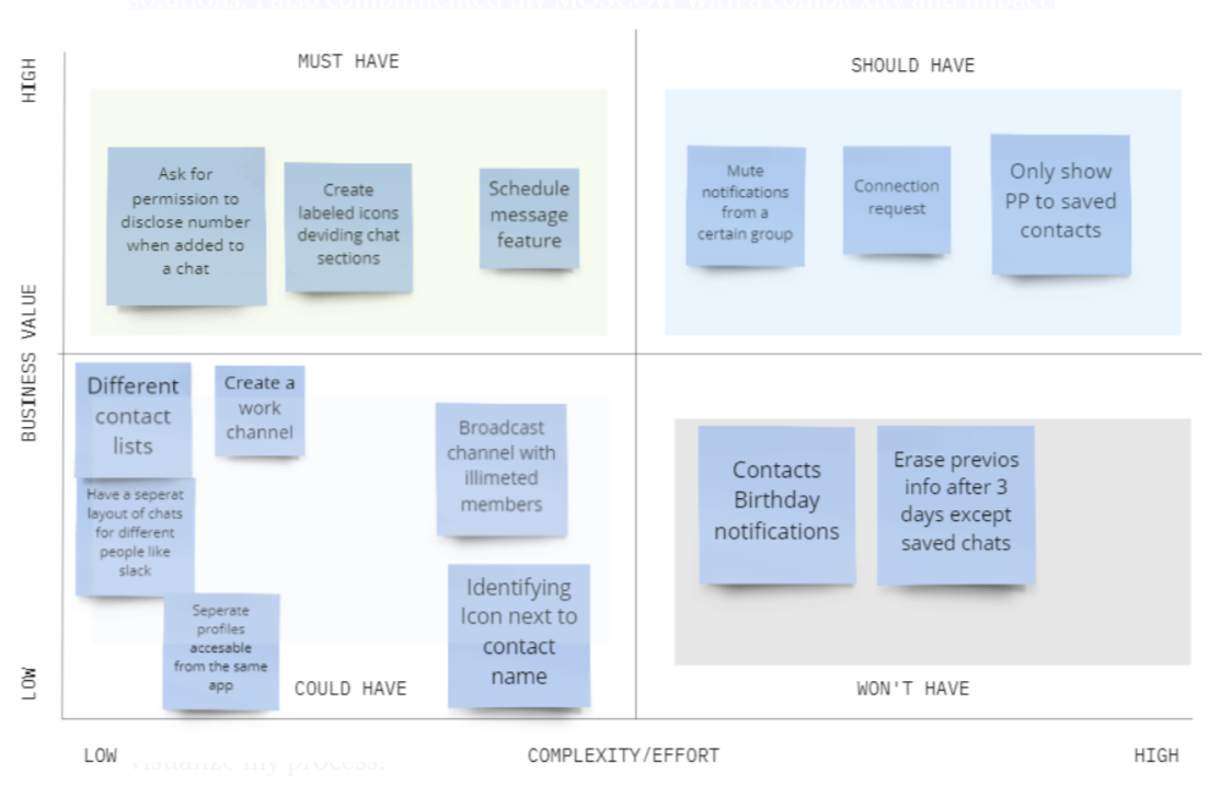
Time to Ideate. I began this stage by taking five (5) minutes of pure brainstorming with each How Might We. After coming up with these unique ideas, I followed the MOSCOW method, to organize and prioritize my solutions. I also complimented my MOSCOW with a complexity and impact quadrant. Take a look.
Develop
Having three key features in mind, I was able to visualize my Minimum Viable Product. An MVP is used to test concepts, in the market in a cost-efficient manner in order to focus on complementary features further on. My MVP was: A feature that allows users to switch through channels that divide contacts by connection type. Afterward, I decided to include a schedule message feature as well.
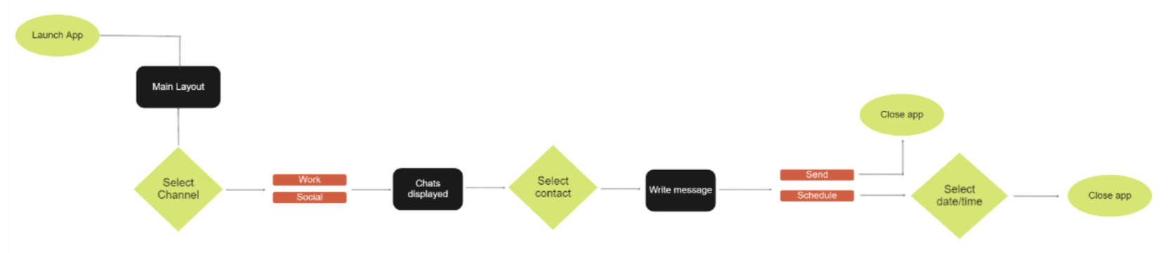
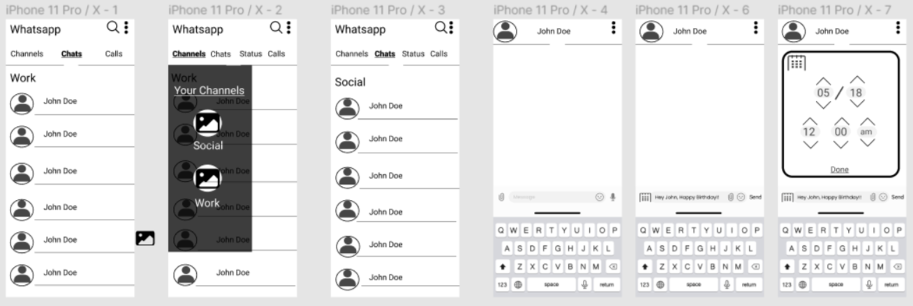
With these concepts at hand, I decided to bring them to life by doing low fidelity, mid-fidelity, and high fidelity designs. All of these are stages in the design process that allow me to test early cheap and easy designs and iterate on problems along the way before putting in all the details. Nevertheless, before getting my hands dirty, I created a flow chart to visualize my process.
Focusing on this simple path I came up with the three design stages. Every one of these stages was tested in Maze, a usability test platform, and perfected along the way. Take a look.
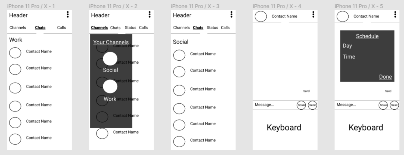
Low-Fidelity Prototype
Mid-Fidelity Prototype
Hi-Fidelity Prototype
Being a daily user of Whatsapp, It was really hard to not start ideating features or the app from the beginning of this project. Nevertheless, as a UX Designer, it is my duty to avoid assumptions and focus on what the users need and feel. The reason why many products fail is that invalidated assumptions lead to products with no value. I am proud to have designed and tested my solutions based on true user-centered research.